Segment
User/device reality
A product bucket such as mobile-large, tablet portrait or laptop explains what kind of viewport pressure people bring.
Start here
This tutorial shows how to turn real phone, tablet and desktop usage into segment decisions, Figma frames, breakpoint aliases, height rules and measured safe checks. You leave with a responsive contract, not just another breakpoint list.
Let's start by defining your audience
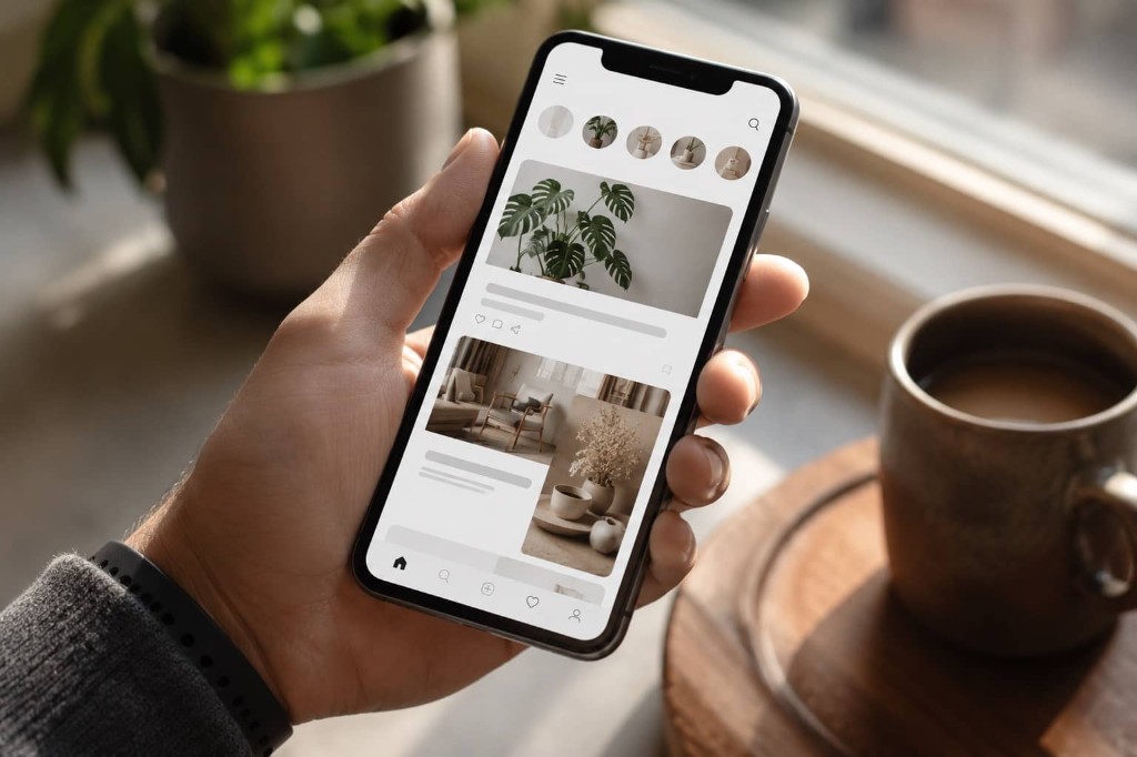
Phone context
Short sessions, thumb controls, readable type and a strong first screen drive the contract.
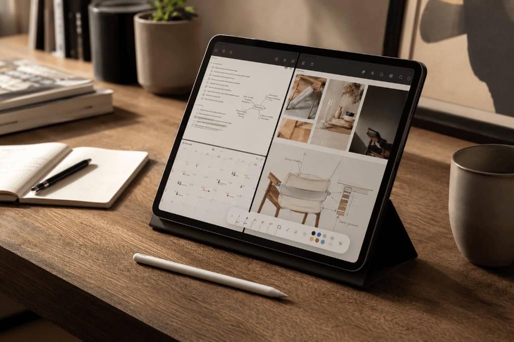
Tablet context
Tablet segments support split-view review, annotation and lightweight planning.
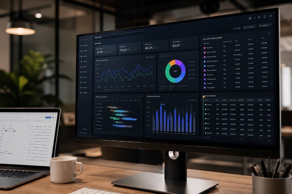
Desktop context
Laptop and monitor segments carry dense grids, comparisons and operational dashboards.
Step 1 · Design x frontend contract
A responsive system breaks when segment, device, safe viewport, breakpoint and Figma frame are treated as the same thing. The contract gives each word one job so design, frontend and QA can make decisions together.
The base layout starts at 0 px. A floor such as 340 px is a stress check for overflow, navigation and primary actions. The breakpoint alias only marks where the next treatment may start.
A product bucket such as mobile-large, tablet portrait or laptop explains what kind of viewport pressure people bring.
The catalog measures what the browser layout viewport safely receives after OS chrome, browser UI and orientation pressure.
A Figma frame is a familiar review canvas. It helps discussion, but it does not become the measured safe viewport.
A breakpoint alias is where CSS may start a layout treatment. It is the implementation trigger in the contract.
Why this matters
With segment, viewport, frame and alias separated, look at the pressures that make “standard breakpoints” fail: usable floors, awkward tablet segments and desktop workspaces that are not equal to their review frame. Every number below can be traced in the Source data section.
Measured evidence examples
Plan frames at design targets. But as a team define the floor that is non-negotiable for usability — even when you never ship a breakpoint variant for it, your website shouldn't break and users have to be able to do what they came for.
The segment looked dead for years — too awkward for phone-only patterns and too small to ignore. Even with low global traffic, flagship foldables and 13″ iPad split view make the ~600–768 px segment worth revisiting for high-value review and planning contexts.
Draw the FHD frame at 1920 px when that is the review canvas, but start the 4xl breakpoint at 1870w and validate against the first measured safe workspace around 1872w. Dock, taskbar, and side panels eat width without changing the device category.
Now the map becomes an implementation contract. Width decides structure, height adds optional vertical room, and every row keeps the segment, Figma frame and measured safe check visible.
Start with the unprefixed base cascade, then use eleven practical targets: a rounded floor check, three core layout changes, and seven optional steps that usually stay fluid. The columns separate the segment envelope, the breakpoint trigger, the Figma drawing frame, and the measured safe validation width. Most teams still ship four to six tiers; treat core rows as the contract and optional rows as opt-in enhancements.
| Alias | Width | Role | Segment | Figma frame | Safe width | Note |
|---|---|---|---|---|---|---|
| 0+ | Default cascade | — | Applies everywhere until a breakpoint overrides it. Floor problems usually belong here. | |||
| ≤ 340 | Base stress floor | 344wfrom Samsung Galaxy Z Fold5 / Folded (cover) | QA only, not a regular breakpoint. The first width where product and engineering agree the experience must stay usable, even if it is not a layout change. | |||
| Phones | ||||||
xs | ≥ 360 | Mobile | 360×800Figma frame (−161 h measured) | 360wfrom Samsung Galaxy S26 | Useful phone design reference, even if it stays optional in code; the base layout must already work here. | |
sm | ≥ 430 | Large mobile | 430×932large phone canvas (−157 h measured) | 430wfrom Apple iPhone 16 Plus | Large-phone enhancement when the UI benefits from more comfort. The Figma frame is a familiar Pro Max-style review canvas, not a measured safe viewport. | |
| Tablets | ||||||
md | ≥ 600 | Tablet / unfolded foldable | 600wFigma frame | 683wfrom Apple iPad Pro 13" (M5) / Split View (½) | Two columns; ~654 px tall | |
lg | ≥ 768 | Tablet portrait | 768×1024Figma frame (+70 h measured) | 800wfrom Google Pixel Tablet (1st gen) (Tensor G2) | Touch-first spacing | |
xl | ≥ 1024 | Landscape tablet / entry laptop | 1024×768Figma frame (−20 h measured) | 1210wfrom Apple iPad Pro 11" (M5) | One layout for both | |
| Desktop | ||||||
2xl | ≥ 1280 | Laptop | 1440×900laptop canvas (−290 h measured) | 1318wfrom Chromebook 1366×768 | The breakpoint starts the laptop treatment at 1280w, while the Figma frame can use the well-known 1440×900 laptop canvas. Measured safe checks the tighter real viewport. | |
3xl | ≥ 1600 | Large laptop | 1600×1000large laptop canvas (−89 h measured) | 1646wfrom Apple MacBook Air 15" | Optional large-laptop review canvas for capping measure, line length and wide-workspace composition before monitor-class layouts begin. | |
4xl | ≥ 1870 | Full HD monitor workspace | 1920×1080FHD canvas (−158 h measured) | 1872wfrom Monitor 24" FHD | The breakpoint starts at the FHD workspace floor, while the Figma frame can stay on the 1920 px panel canvas. The first measured safe frame is 1872w. | |
5xl | ≥ 2500 | QHD monitor workspace | 2560×1440QHD canvas (−518 h measured) | 2512wfrom Monitor 27" QHD | The breakpoint starts at the QHD workspace floor, while the Figma frame can stay on the 2560 px panel canvas. The first measured safe frame is 2512w. | |
6xl | ≥ 3350 | Ultra-wide canvas | 3440×1440ultra-wide canvas (−130 h measured) | 3392wfrom Ultrawide 34" 21:9 | Optional stress test for comparison views, timelines and other layouts that genuinely benefit from extra width. The breakpoint starts below the 3440 px panel canvas and measured safe checks the real workspace. | |
Mobile-first on the vertical axis too: unprefixed styles must adapt at the floor, then optional min-height steps add room for heroes, modals, sticky actions, forms and keyboard-heavy flows. Height aliases share the width naming pattern with an -h suffix — same contract language, independent pixel values. The same number is a min-height enhance threshold in code and a max-height stress check in QA; height tiers are independent from width tiers, so a desktop-height trap can sit between phone and tablet heights.
| Alias | Height | Role | Context | Safe height | Note |
|---|---|---|---|---|---|
| 0+ | Default cascade | — | Applies everywhere until a min-height variant overrides it. Height floor problems usually belong here. | ||
| ≤ 340 | Layout height floor | 258hfrom Samsung Galaxy Z Fold5 / Folded (cover) | QA only, not a regular breakpoint. When a phone rotates, width often jumps to a tablet-class layout, but height collapses to roughly 340 px. The base layout must still work here: no clipped CTAs, no unreachable navigation, and no reliance on min-height variants that never apply at this pressure. | ||
| ≤ 510 | Portrait height floor | 549hfrom Apple iPhone SE 3 | QA only, not a regular breakpoint. The first height where product and engineering agree the portrait experience must stay usable — navigation, primary actions and forms included — even when vertical space is already tight. | ||
xsh | ≥ 510 | Short phone / keyboard | 549hfrom Apple iPhone SE 3 | First optional min-height enhance after the portrait height floor passes. Keep primary actions reachable when the viewport is still short. | |
smh | ≥ 640 | Mobile fold | 639hfrom Samsung Galaxy S26 | Common mobile fold pressure. Heroes and forms should still make sense; use min-height in code, max-height in QA. | |
mdh | ≥ 720 | Laptop trap | 610hfrom Chromebook 1366×768 | The laptop trap: desktop width, but not much vertical space. Relax fold pressure when min-height allows it. | |
lgh | ≥ 900 | Comfortable laptop / tablet | 946hfrom Apple iPad Pro 13" (M5) | Comfortable height for richer first screens on tablets and laptops. | |
xlh | ≥ 1080 | Monitor-class | 922hfrom Monitor 24" FHD | Monitor-class height. Useful for optional richness, but not the default assumption. |
Case study
The laptop treatment shows how one segment becomes an alias, a review frame and a measured safe check.
2xl contract
Interactive example
Same segment as above — Laptop segment · 1280–1599w. Stretch the web layer or pick a ruler to see how segment envelope, reference Figma frame, measured safe and CSS breakpoint are separate widths.
For laptop, 1440 is the drawing canvas — not the breakpoint. Start the layout at 1280w, and use measured safe to check the design still adapts. The layout adaptation is explicit: crop empty side space, clamp content width, tighten gaps.
Token pipeline
The contract becomes useful when every tool reads the same source instead of copying random pixel values into Figma, Tailwind, docs and QA checklists.
Figma, Tailwind and QA can all need the same responsive decision, but each tool needs it in a different shape. The package keeps one source and generates the right output for each side.
packages/responsive-contract/src/tokens.{
"viewport": {
"breakpoints": {
"2xl": {
"value": "1280px",
"segment": "laptop",
"rule": "core",
"figmaFrame": "1440x900",
"measuredSafe": {
"width": "1318px",
"source": "generated from catalog",
"usage": "QA validation viewport"
}
}
}
}
} Design tokensSource JSON
 FigmaVariables/import
 TailwindGenerated screens
Measured evidence layer
Use source data when the team asks where a number came from. Use the board and catalog when you need to prove a real page survives that pressure.
Practical validation
The catalog explains which devices drive each safe value. The board lets you test a real page against those same viewport pressures before the contract becomes team policy.
Open the measured segments when you need safe viewport windows, source devices and browser drivers.
| Segment | Worst-case safe | Measured window | Width driver | Height driver | Devices |
|---|---|---|---|---|---|
| Mobile | |||||
| Small mobile / foldable folded<360 css px | 344 × 549 | 344–412 × 549–880 | Samsung Galaxy Z Fold5 / Folded (cover) · Chrome | Apple iPhone SE 3 · Safari | 3 |
| Mobile360–429 css px | 360 × 639 | 360–420 × 639–924 | Samsung Galaxy S26 · Chrome | Samsung Galaxy S26 · Chrome | 9 |
| Large mobile430+ css px | 430 × 775 | 430–440 × 775–956 | Apple iPhone 16 Plus · Chrome | Apple iPhone 16 Plus · Safari | 2 |
| Tablet | |||||
| Small tablet / foldable unfolded portrait<768 css px | 683 × 654 | 683–750 × 654–1133 | Apple iPad Pro 13" (M5) / Split View (½) · Chrome | Samsung Galaxy Z Fold7 / Unfolded · Chrome | 3 |
| Tablet portrait768–1023 css px | 800 × 1094 | 800–820 × 1094–1280 | Google Pixel Tablet (1st gen) (Tensor G2) · Chrome | Apple iPad (A16) · Safari | 4 |
| Large tablet portrait1024+ css px | 1024 × 946 | 1024–1376 × 946–1366 | Apple iPad Air 13" (M4) · Chrome | Apple iPad Pro 13" (M5) · Safari | 2 |
| Small tablet / foldable unfolded landscape<1024 css px | — | — | — | — | — |
| Tablet landscape1024–1365 css px | 1210 × 748 | 1210 × 748–834 | Apple iPad Pro 11" (M5) · Chrome | Apple iPad Pro 11" (M5) · Safari | 1 |
| Large tablet landscape1366+ css px | — | — | — | — | — |
| Desktop | |||||
| Small laptop<1280 css px | — | — | — | — | — |
| Laptop1280–1599 css px | 1318 × 610 | 1318–1536 × 610–874 | Chromebook 1366×768 · Chrome | Chromebook 1366×768 · Firefox | 8 |
| Large laptop1600–1869 css px | 1646 × 911 | 1646–1728 × 911–1009 | Apple MacBook Air 15" · Chrome | Apple MacBook Pro 16" · Firefox | 2 |
| External monitor1870–3349 css px | 1872 × 922 | 1872–2560 × 922–1332 | Monitor 24" FHD · Chrome | Monitor 24" FHD · Firefox | 2 |
| Ultra wide3350+ css px | 3392 × 1310 | 3392–3440 × 1310–1360 | Ultrawide 34" 21:9 · Chrome | Ultrawide 34" 21:9 · Firefox | 1 |
Assumptions: bookmarks bar visible, OS bar shown (bottom or side Dock on desktop), and small viewport height (svh on touch, maximized baseline on desktop). The result is a realistic default, not every possible user setting or every future device.
Terminology
Same words in Figma, frontend specs and QA — different jobs, no random pixel values.
A product/data segment such as mobile-large, tablet portrait or laptop. It describes a kind of viewport pressure, not one exact device and not a CSS rule. The code still calls this layer a design bucket for API compatibility.
A concrete catalog profile such as a phone, tablet, laptop or monitor. Devices provide evidence for segments, but CSS still responds to the viewport it receives.
The logical CSS pixel space available to layout after browser and OS chrome. This is the width and height that media queries and responsive CSS actually work with.
A named implementation trigger such as xs, md, 2xl or mdh. It is where a layout treatment may start, not proof that a user owns a specific device.
A familiar canvas used for design and review, such as 1440×900 or 1920×1080. It helps teams discuss the treatment, but it does not replace measured safe validation.
The tightest measured layout viewport for a segment in the curated catalog. It is generated from device/browser rows and tells QA what the treatment must still fit.
The defensive width × height box for a segment. Width and height can come from different measured devices, so it is a validation envelope rather than a promise of one exact real screen.
A broad grouping such as phone, tablet or desktop used for visual grouping and discussion. It is not a media query by itself.
Base = default cascade plus floor checks. Core = layout changes worth designing and testing. Optional = enhancements that often stay fluid unless your product benefits from them.
The mobile-first default that applies from 0 px until a breakpoint overrides part of the layout. Floor issues usually belong in the cascade, not in a new breakpoint.
A non-negotiable stress check where navigation, primary actions and content must still work — even when you never ship a breakpoint variant for that pressure.
An optional secondary comparison canvas. Useful for comfort checks, but it must not redefine the breakpoint or replace measured safe validation.
The logical viewport width the layout actually receives. DPR affects sharpness, not breakpoint width; OS/browser scaling changes this CSS width and should be respected as the user’s density choice.